Case Studies
How I help build great services with User-Centred Design and research.
Contents
- User research for the Scottish Government
- Running a redesign for ACM
- UX and UI design for Royal London
1. User Research for the Scottish Government
Challenge
I was hired to do User Research for three projects:
- designing a new government Payments system for moving funds between different departments
- designing a service for Scotland’s new Disability Benefits system
- a Discovery project for the new Scottish National Investment Bank
In each case the government knew what it wanted to deliver but brought me in to help them take a user-centred approach.
Approach
The Government has a Scottish approach to service design inspired by the GDS Design Service Manual. I'd learned this from working with Scottish Enterprise and at the Student Loans Company. We fed into Discovery phases by talking to people who would use the systems we developed.
I start by researching my team
When I start a contract I go round the office booking time to meet people. I take sketchnotes of everything they say and go back over them with a highlighter.
Meeting people helps me orient myself with the project’s aims as they’re not always written down. I’ll get a feel for everyone’s personal style and a rough map of who the key stakeholders are – I won’t always get to meet them in person but I will want to know who will review the project’s outputs.
After this I ran kick-off meetings with the teams I was embedded in to generate research questions. I used these to design our research approach. I also booked regular catch-ups to play back research findings and check the team’s understanding of what we’re doing. In particular I make sure the Product Owner is getting answers to the questions they want to answer.
I pay attention to survey data
In the first project we ran a survey to get inputs from organisations we couldn’t meet in person. In the second, the social research team provided me with a set of 400 survey responses. I analysed these and turned them into a visual output for the team. The surveys gave me quantitative data (measurements) to go with qualitative data (descriptions, from interviews and observations).
I run desk research, visits and and interviews
To get an idea of who would use a government payment system I worked with a graduate researcher to put together a list of organisations to talk to. We then carried out a program of observational interviews. We travelled to various finance offices to see how the administrators and accountants carried out their daily tasks. Along the way we noted:
- artefacts – documents they would use
- tools – the hardware and systems on their desks
- team structures, including quality assurance and line management
For the Disability Benefits project I ran a visit to Belfast to gather insights on how decision makers processed the benefits. I also put together a list of stakeholder organisations who worked with disabled citizens and arrange a program of interviews to work out how we could make it easier for citizens to apply.
Outputs
For each project we ran sense-making with our teams to go through the data we had. We also invited our test subjects back to go over our collated findings. This made sure that we kept some objectivity in our research practice and stayed aware of our own biases.
Finally, for the Benefits project we created Decision Inventories as visual outputs for our teams. This showed the processes that decision makers took when awarding citizens benefits, their pain points and the resources they used such as training documents and books of regulations.
2. Running a redesign
Challenge
ACM hired me to design version 6 of AdvicePro, a popular software package for advice workers in local authorities and housing associations. ACM are a small software company with a viable product who had never involved a designer before.

Approach
I began by generating ideas from the entire team. I turned these into wireframes and prototypes moving from low to high fidelity as we did research.
I start with sketching
I’m a fan of Jake Knapp’s Sprint! for generating ideas from teams. To generate ideas and avoid groupthink I booked one-on-one sessions with every member of the team to sketch out how they thought the software should work. I then ran a session with the whole team to evaluate all the sketches and got a decision maker to choose the elements he like best. I combined these into the first wireframes.
I iterate on a design
I live with a design over the course of a project. I generally look at it every morning then tinker with a few things. I invite people over to review it informally.
I occasionally do big ‘reveals’ for the whole team but these can be slightly risky. I have a lot of decisions to make when I’m creating a product: there are times when the wider team don’t like what I’ve done, especially if they have been working on a product for years and they’re used to how it works. To take the team with me, I test a prototype on real users.
I organise on-sight visits and run usability testing
Most organisations are now open to the idea of testing their products as they’re developed. For ACM I took my laptop with an Axure prototype to different advice offices. I recorded the screens and audio. I gave the workers several short tasks to complete and used the talk-aloud protocol to capture their reactions to AdvicePro 6. I then edited the recordings and played them back to the whole team to get their reactions.
I make data maps and capture headline data
I learned two approaches from this project: creating data maps and picking headline data.
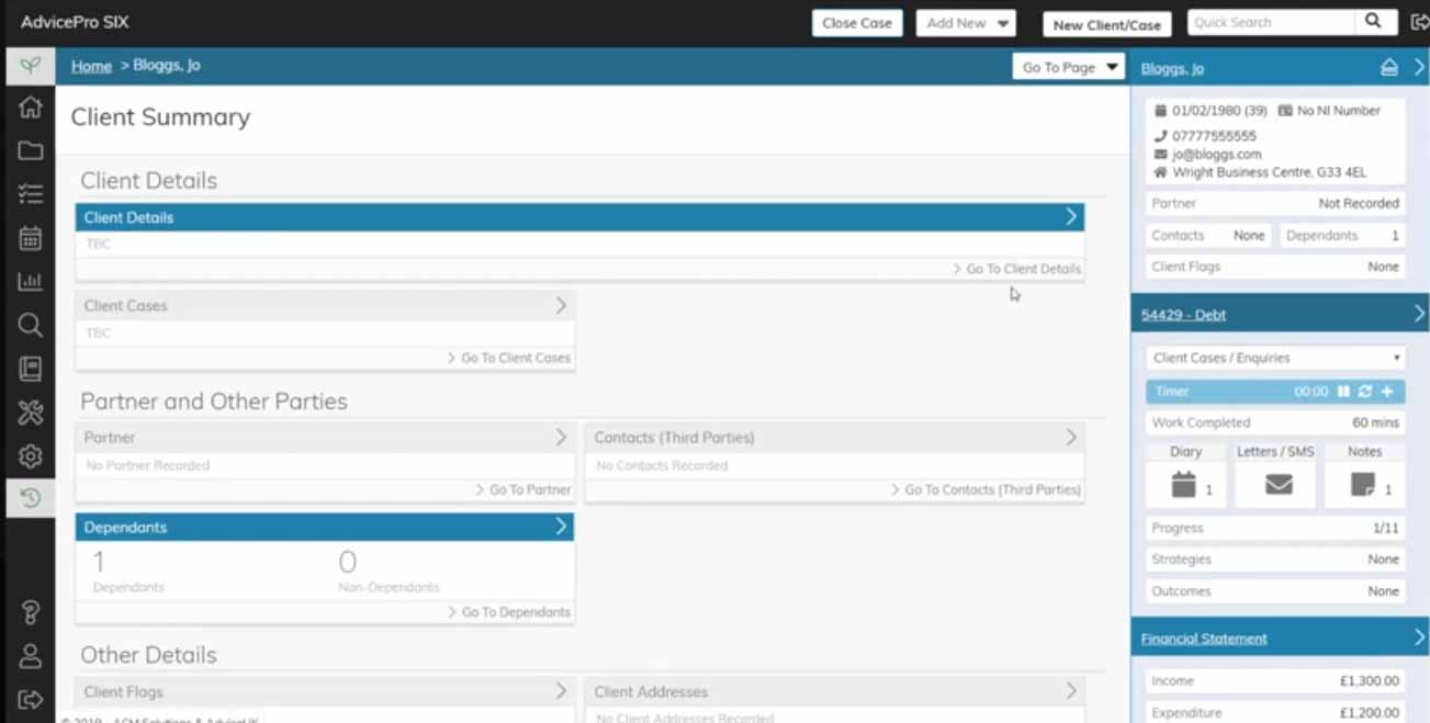
The software was built around interconnected types of data: clients, cases, tasks, notes. I found the relationships between them all slightly baffling so I created a map and put it on the wall as a poster.
‘Headline data’ is about the information architecture concept of ‘progressive disclosure’. Software has to occupy a limited space on a screen, so a designer has to choose the most important thing to show in the most prominent place. After I identified that cases had types (housing, immigration, money advice and so on) and had states (open, closed, on hold) this led me to come up with a hierarchy of what to show on each screen. From this I designed the new user interface.
I start with lo-fi designs
I start with black and white wireframes with a few shades of grey to contrasting emphasis. The first element of colour I usually add are the call to action buttons. As time goes on I will experiment with different layouts and add animated transitions for a more usable, delightful experience.
3. UX and UI design at Royal London
Challenge
In 2015 Royal London were ready to modernise their online service with a new application for Protection insurance. In the Pensions division the #thinkbeyond project was looking at transforming the online customer experience.
Approach
I used a combination of user research, UI design and rapid prototyping to get buy-in from key stakeholders and help transform the company.
Simplifying a customer dashboard with user research
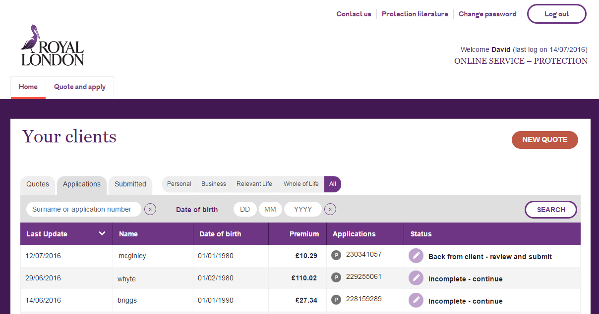
I worked with a user researcher to create personas for financial advisers and their administrators. We validated these with contextual enquiries (office visits). I used these to simplify a dashboard into a table of applications and a prominent ‘New application’ button.

The original design I was given had an unnecessary ‘Updates’ table and a right-hand column with extra contact information. Good design involves getting rid of unnecessary elements and focusing on the essentials.
Relaunching a service with responsive design
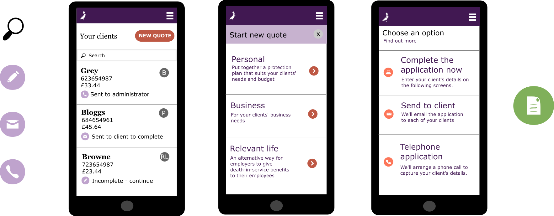
When I arrived at Royal London the product owners would pass requirements directly to developers without considering how to make the journey usable and attractive. I worked with a visual designer to incorporate the company brand then worked with business analysts to develop a run of screens. I started with paper sketches then built these up into high-fidelity designs. Before the launch, we validated these by visiting financial advisers in their offices and running usability testing. After the launch the new service took in over £1 million pounds of new business per week. We presented our work to the CEO Phil Loney.

Capturing ideas with rapid prototyping
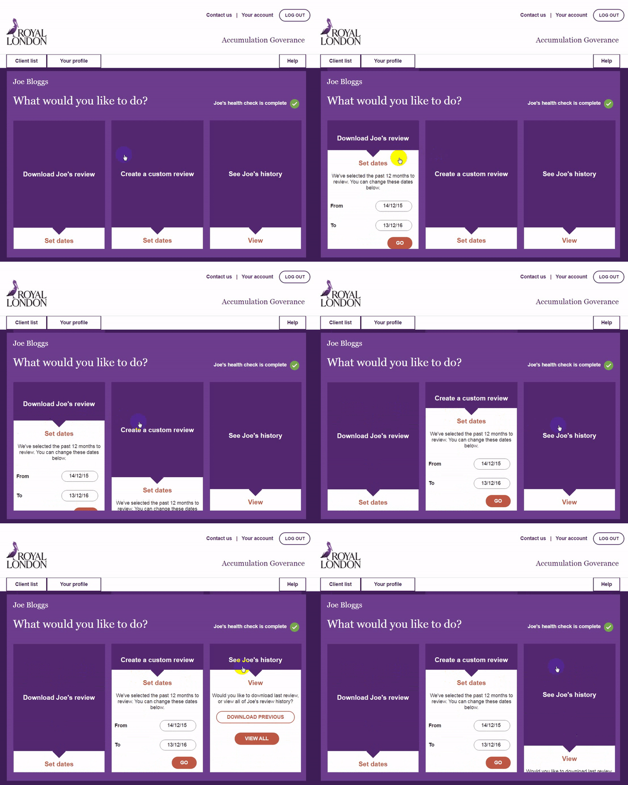
In the #thinkbeyond project I supported two Discovery teams looking at ways of relaunching Royal London’s online Pensions service. I worked with subject matter experts to define customer journeys and capture pain points. To capture each team’s ideas I created prototypes of new online calculators and apps.

We validated our ideas by running a programme of customer engagement which put Royal London in close contact with their end users for the first time.